Our Brand
Intriguing branding engages our supporters, donors and those who are curious about leprosy, allowing us to share vital knowledge and developments within the leprosy world. Additionally, engagement supports our Triple Zero vision which aims to see zero transmission of leprosy, zero leprosy related disabilities and zero leprosy discrimination globally by 2035.
Below you will find information about the history of our logo and the developments we have made in our colour pallet and illustrations to create a memorable brand image.
The History of our Logo
The Leprosy Mission’s logo dates back to the 1920s. It was designed as a woodcut by an English artist called Mabel Royd. The woodcut design represents Jesus and the man with leprosy who knelt at Jesus’ feet and asked to be healed (see Mark 1:40-42).
The carving expresses the desire of The Leprosy Mission’s founder, Wellesley Bailey, who wrote “I felt if ever there was a Christ-like work in this world, it was to go among these poor sufferers and bring to them the consolation of the Gospel.”
The logo was originally designed by Donald Miller, the Mission’s Secretary for India. Miller sketched the first version and asked Mabel Royd to produce a carving, after being impressed by her work. Unfortunately, Miller’s first draft was lost at sea when a ship was torpedoed during the Second World War, but based on copies that had been sent to London, Royd was able to produce a carving of what we use today as the basis for The Leprosy Mission’s logo.
Today’s logo has its roots in a version of Royd’s carving by Eddie Askew, an artist and a former TLM International Director.
Our logo today
Our logo uses our iconic emblem, paired with a bold new namestyle. This makes the logo much more legible on screen (especially at smaller sizes) and helps it to stand out in a crowded charity landscape.
New Colours and Illustrations
Our Colours:
Using vivid, bright colours plays a significant role in setting us apart from other charities. The use of our colours provides continuity throughout our branding, lending a hand in generating a recognisable brand image. We have moved away from our previous colours (marron, blue and black), to a new aery of colours, creating a fresh sense of warmth, vibrancy and energy.
Our logo appears on white and yellow backgrounds with beet purple text and a carmine red logo. On all other background colours our text and logo will appear white. Background colours include beet purple, carmine red, raw indigo blue, nettle green, carrot orange and turmeric yellow. We only use a black logo when grayscale printing is required.
The names of our colours are taken from the natural dyes used in traditional clothing. This is inspired by the colourful outfits that grace many of our photographs.
Our Illustrations:
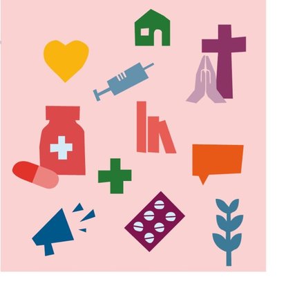
Illustrations are essential in communicating the work we do. Our shapes and illustrations have been created using a hand-cut style in our pallet of colours and tints. Meanings have been assigned to many of our illustrations, for example, the blister pack of medication represents the Multi-Drug Therapy used to kill M.leprae bacteria and the praying hands that symbolise the Missions dedication to honor God in all the work we do.